Personal Identity
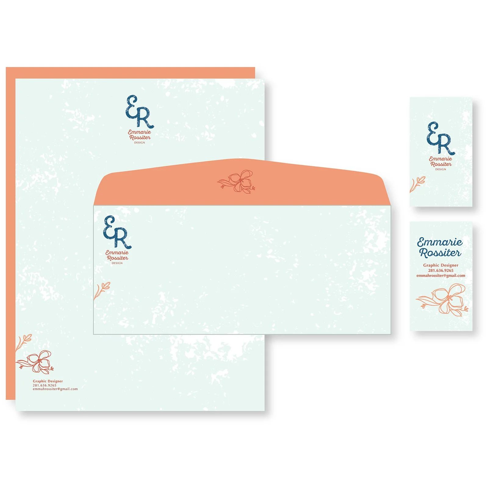
My primary personal branding was designed with the intent to reflect me as an individual and my style of art-making. One of my passions other than graphic design is painting, and the flow of the letters is to represent the flow in how I create. The intent behind the texture and simplicity I applied to my logo was to give the mark a contrast of industrial yet professional. The colors I chose are based on the balance I have of warmth and calmness. However, I have made many logos and the one on this website was drawn by me to reflect my playful nature and inclination towards all kinds of mediums. I made the butterfly to look like a stamp because of my love of texture. The font is Scale VF Regular. The colors are feminine yet neutral.


